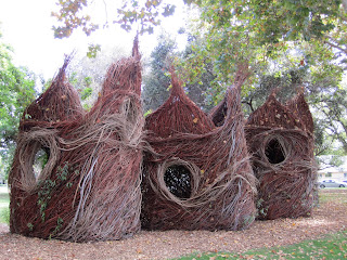
Patrick Dougherty is an artist who uses renewable resources to craft beautiful, dynamic structures. his work material is sourced from local plants and shaped and woven without the use of metal nails or synthetic glues, just the delicacy and dexterity of human hands. this particular piece, called Double Take, was made from willow and poplar branches from a place in California.
Double Take is quite easily the most exciting and inspiring piece of art i've seen all year. my first response to it, as i rounded the corner and first caught glimpse of it, was that it looked like something from out of Where The Wild Things Are.
in fact, that's a good way to start describing the impact the work had on me. the atmosphere and feel of the Wild Things movie was fantastical, vaguely familiar and slightly off-putting, like a dream, a vivid dream that is sublimely vibrant and intensely textured. this is the same effect i got when i approached Dougherty's work: i felt other-worlded, the way you do when you confront something strange and beautiful for the first time. gargantuan nests of woven branches standing over 20 feet high on the corner of a neighborhood - their staggering beauty and seeming defiance of natural laws and elements completely belie the humble materials of which they are made.
from the rigidity and strength of twigs, branches and splinters, Dougherty shaped structures that imparted smooth, liquid movement, at once evoking the hot licking flames of fire and the gushing, explosive force of water. the branches look as if they are constantly wind-blown, but stand hardy and strong despite the elements. the structures are both deeply rooted* into the ground and reaching skyward.
*a little girl shows me how they watched the artist use larger, thicker branches to form a frame, and then dug deep into the earth to root them, later burying them so the whole structure would remain in place.
indeed, what makes Mr. Dougherty's structures so captivating is how full of contradiction they seem. the unnatural, conspicuous beauty of the whole contrasting with the humble parts. the fluidity despite rigidity. the deep-rootedness coexistent with upward flight. even though Mr. Dougherty builds his works of art with the intention of allowing them to decompose naturally under the elements, Double Take seemed impervious to weather and the seasons. i went at a good time, the day after the first day of autumn, and the leaves were beginning to show the first signs of changing color and had begun to fall, landing on ledges in the sculpture windows, sometimes catching in spiderwebs to spin perpetually in the wind. from the ground, vines have started climbing their way up the face of the walls. the sculpture looks every bit as alive and dynamic as i imagine it did in January 2011 when it was finished.
the other dimensions of the sculpture which made it so exquisite: the smell. i wish i could have captured the smell to share it with you. all around it and inside it was the freshest piney fragrance, like being deep in evergreen woods on a clear snowy morning. crisp, clean, comforting, and invigorating.
also: the way it invited interaction. in the hour i was enjoying the sculpture, i met two little girls, who rode their bikes right up to me and asked me, "do you know who made this!!?" they were so excited to start talking about it, and wanted to show me all the ways they could climb in it, on it, around it. after them, a trio of senior citizens came and walked through it, poking their heads out of windows to grin at each other. after them, a family of a dad and his two boys, both under 7 years of age. the boys would go to a window and play a game with their father in which they pretended to serve him a fast food order ("do you want sweet potatoes or ice cream, dad?" "do you want ice cream with that?" "you get ice cream because you're the man.") seeing everyone have so much fun with the art made me realize how rare an occasion it is to actually be able to touch and play with something so beautiful that is also not fragile or protected behind glass.
another amazing thing about this piece was how three-dimensional it was. this seems obvious at first, because of course a sculpture is 3D. but think about the sculptures you see in museums, and how there are only approximately 4 different angles (from the front, rear, left and right sides) at which to view a sculpture before you've exhausted visual interest. supposedly symmetry is a sign of beauty, but it makes for, ironically, flat and boring art. not so with Mr. Dougherty's work: i walked around the entirety of his work for about an hour, and photographed a new angle each time. each section of Double Take, like a tree in a forest, was remarkably individual and irreproducible.
now, for lack of any more words (or perhaps too many), a glimpse inside Double Take. i shot this video while walking through the inside of the work. you can see the phenomenal craftsmanship that went into the weaving and construction of the piece. you can also hear the sound of children playing, the distant chirping of a bird, see the light and hear the wind, as well as the traffic from the nearby street, and the sound of my feet on the brittle wood pieces on the ground.


No comments:
Post a Comment